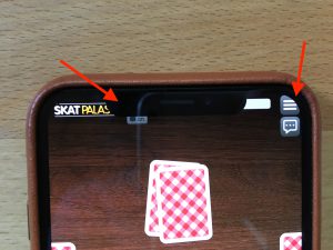
The iPhone XS, iPhone XS Max and iPhone XR have arrived and all come with a Notch that we already know from the iPhone X. As a developer it is your responsibility to adjust your Air app accordingly to make sure you have a safe area at the top and bottom of the device. Because if you don’t, the Notch will cover your UI at those areas.

Request the full device resolution in your app
First, make sure that your app will be able to render at the native resolutions of the new iPhones. If you don’t request the native rendering resolutions of the device, the new iPhones will fall back to use the resolution of older devices that you support and add black bars on the top and bottom of your app. Technically that makes no problems, but the black bars prevent your users from getting the most of your app. Also, Apple will not allow you to release updates of your apps until you use the complete screen for your app and support the Notch correctly at full resolution.
To request the native resolution of the latest iPhone generation, you will have to include the correct Splash Screens in Air. You can find the complete list of supported splash screens in Adobe Air here. A complete discussion of splash screens is outside of the scope of this article, but in short, the Splash Screens for iPhone X and iPhone XS should have these names:
Portrait: Default-812h@3x~iphone.png
Landscape: Default-Landscape-812h@3x~iphone.png
At the time of this writing, no splash screens for iPhone XS Max and iPhone XR are supported by Adobe Air, meaning we will have to wait until Adobe releases an update.
If you have already released an update of your app recently then chances are that you already support the iPhoneX resolution with the correct splash screen. That means without any further change, your app will also run on the iPhone XS in native resolution right now, because iPhone X and iPhone XS share the same device resolution.
In our case that was a problem because in our code we activated the Notch logic based on the deviceModel. But we did not handle the Notch for the iPhone XS correctly, because when the code was written, the iPhone XS did not yet exist. Since the app already requested the native resolution of the iPhone XS but did not activate our Notch code adjustment, the UI was covered by the Notch and breaking the user experience.
Model names of the new iPhones
To correctly adjust our code to support Notch rendering logic, we are checking for the deviceModels and activate the code accordingly.
These are the device model identifiers of iPhones that come with a Notch:
| iPhone X | iPhone10,3 |
| iPhone X GSM | iPhone10,6 |
| iPhone XS | iPhone11,2 |
| iPhone XS | iPhone11,2 |
| iPhone XS Max | iPhone11,4 |
| iPhone XS Max China | iPhone11,6 |
| iPhone XR | iPhone11,8 |
Check for these device models and update your rendering accordingly. The deviceModel information is not available in Air by default, but you can use a native extension to retrieve it, for example this one.
Code Example
Here is a code example of how to set the correct paddings in your application for a Notch device. That means no buttons or other important content should be inside the safe area.
private function updateViewportPadding(width:Float, height:Float, deviceModel:String):Void
{
	var notches:Array<String> = ["iPhone10,3", "iPhone10,6", "iPhone11,2", "iPhone11,4", "iPhone11,6", "iPhone11,8"];

	//If iPhone with notch: add padding
	if(notches.indexOf(deviceModel) > -1)
	{
		var NOTCH_SIZE :Float = 88;
		var BOTTOM_SIZE:Float = 68;


		//Landscape - left: 88, top: 0, right: 88, bottom: 68
		if (width > height)	viewport.setPadding(NOTCH_SIZE, 0, NOTCH_SIZE, BOTTOM_SIZE);
		//Portrait - left: 0, top: 88, right: 0, bottom: 68
		else   			viewport.setPadding(0, NOTCH_SIZE, 0, BOTTOM_SIZE);
	}
}
Please note that the above is Haxe code, but it should be easy to adjust it to Action Script 3. The viewport in our case is a class that holds information that tells the app where to render the content on the stage. You will have to add a similar logic to your code by yourself.
On the current generation for all iPhones with a Notch, the top safe area is 88 pixels and the bottom safe area (where the iOS swipe bar is located) is 68 pixels. In our app, we use a top padding of 88px and a bottom padding of 68px in portrait mode, and a left padding of 88px, a right padding of 88px and a bottom padding of 68px in landscape mode.
Now you need to call this function on startup and whenever your device rotates. That way you calculate the proper padding for the current orientation. Obviously the behavior is different, depending whether the device is running in portrait or landscape since the Notch rotates together with the device.
Of course the tricky part is how your application will keep the content inside of the padding. But this is your job as a developer and there is no one fits all solution. You will have to make sure that every screen and every scene of your app will respect this padding and not render below the Notch or the safe area at the bottom of the device.
Ready for the Future
If you happen to have a server that your application connects to, I would recommend that you send the deviceModel on startup to your server and send the Notch data back to your client. That way, your app will be future proof and you can add new devices on the server to handle the Notch without updating your clients whenever new devices with a Notch are released.
Happy coding!
